
Bertukar!
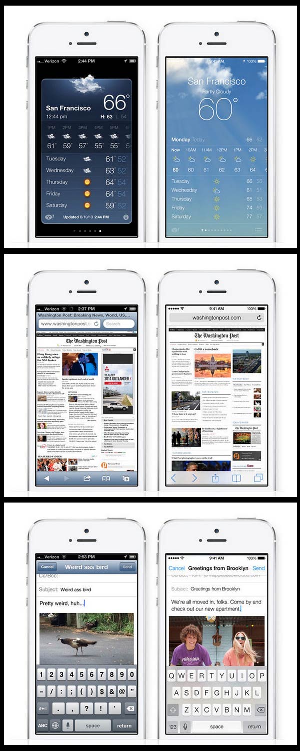
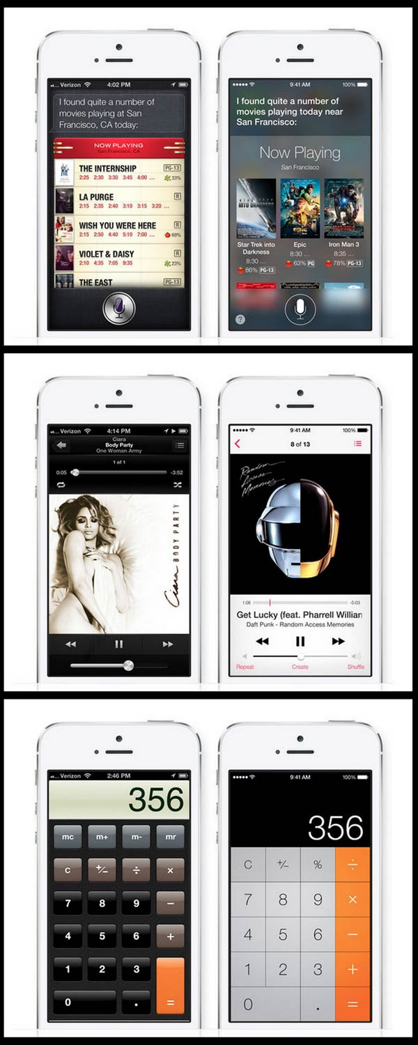
Apple pagi tadi memperlihatka antaramuka baru IOS7 kepada umum. Rekaan baru ni lebih "rata" berbanding IOS6 yang banyak menggunakan gradient. Adakah anda bersetuju dengan perubahan mendadak IOS? Kami rasakan rekaan baru ini agak aneh dan tidak Apple langsung. Nampak agak tadika. Then again I am not Jony Ives so what do I know eh?


Laporan asal FastCo


Apakah ios7 ni downgrade graphics ke? habis semua nampak flat.
ReplyDeleteBelum betul2 release lg bro
DeleteKalau nk try sendiri boleh cuba kat SINI
its look like Windows Phone Wannabe...pftttt, Window Phone FTW!
DeleteThis is what they call flat design
ReplyDeleteminimalis
ReplyDeleteMacam android pun ada.
ReplyDeleteni bukan minimalis, nampak dah sangat macam phone utk budak tadika.
ReplyDeletecolourful, flat dan boderless buttons
tiru windows gamak ny
ReplyDeleteyg pasti mesti ade comments "it feels smoother/faster"
ReplyDeleteso very much like the thousands of Android customizeable skins. Bye bye originality.
ReplyDeletethe ends of Mr. Jobs' legacy..
ReplyDeletehaha padan muka apple fags
ReplyDeletelove it.
ReplyDeletehaters gonna hate. lalalala
ReplyDeletecopying Windows Phone and Android..
ReplyDeleteDh mcm android la pulak...
ReplyDeleteCutting down rendering power for UI.
ReplyDeletesungguh inovasi ... jam dari pukul 10.15 jadi 9.40
ReplyDeletehaha hanya pada perubahan grafik? pada pengguna android or WM, ia di panggil custom ROM. kesian apple fag di tipu mentah2
ReplyDelete